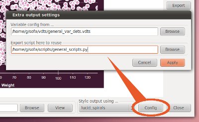
Most of the SOFA charting functionality is now in place and it is now possible for users to configure their output charts. In addition to being able to select theming, the following options are currently available:
Simple bar charts and pie charts can now be sorted (unsorted, by label, by frequency, by descending frequency).
Users can include or exclude display of percentages in bar, line, and area chart tooltips.
Axis titles on charts are now bold and better positioned vertically to distinguish more easily from axis labels.
Another change is that histogram have more human-friendly bin sizes where possible e.g. 10 to <20 rather than 13.8 - 14.5 etc.
[caption id="attachment_493" align="aligncenter" width="188" caption="Better histogram bins"] [/caption]
Analysis dialogs have been simplified by shifting some settings into a separate dialog.
Chart type buttons have been restyled and it is easier to identify which button has been selected across operating systems:
The other main change to charting is that long chart labels are now split into lines.
Additional changes include:
- Scatterplots have option of removing dot border (useful if almost all values are overlapping other values e.g. in a line).
- Added hour glass for display of chart output (can matter for scatterplots on slower machines).
- Existing default report is archived on upgrade to ensure any new chart content displays correctly in the default output.
There is one very important bug fix – 0.9.18 introduced a bug stopping two types of statistical test output from being generated. This was easily corrected.
Additional bug fixes include:
- Flicker removed when changing between chart types in chart dialog.
- Fixed bug when changing variable details in charting dialog.
- Scatterplots drop minor ticks when few unique x values e.g. agegroup vs weight.
- Chart buttons visibly change when selected, even on Mac.
- Fixed layout and read-only status of config button in projects dialog.
SOFA Statistics is getting a lot closer to being ready for a version 1.0 release.


